Graphic design for print requires a different approach than digital design. Factors such as resolution, colors, paper type, and finishes can make the difference between a mediocre print and a visually striking piece.
Professional designers master techniques that ensure high-quality prints with vibrant colors, sharp details, and a professional finish. In this article, we will explore five key tricks experts use to achieve outstanding results.
1. Proper Use of White Space to Balance the Design
One of the most common mistakes in printing is overloading the design with too many elements, which can make it difficult to read and reduce its visual impact. White space is a crucial resource that helps balance composition and directs the viewer’s attention to the most important elements.
How to Effectively Use White Space:
- Avoid margins that are too narrow, which can make the design look crowded.
- Use strategic spacing between paragraphs, images, and graphic elements to improve clarity.
- Apply visual hierarchy by emphasizing titles and key elements with greater spacing.
The most effective designs strike a visual balance between text and images without overwhelming the reader with excessive information.
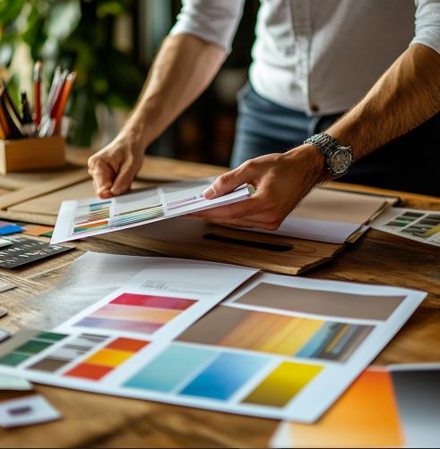
2. Choosing CMYK Colors to Avoid Unexpected Results
One of the biggest challenges in customized printing is color management. Often, what appears on screen does not match the printed result, leading to inconsistencies and disappointments.
Tips for Accurate Color Reproduction:
- Always design in CMYK mode, as it is the standard for printing, while RGB is for digital screens.
- Convert colors to CMYK before sending the file to print to ensure consistency.
- Avoid overly saturated or bright colors, as they may lose intensity when printed.
- Use Pantone color guides when absolute color precision is required.
If color accuracy is critical, it’s advisable to request test prints before producing large volumes to ensure the tones match expectations.
3. Selecting Typography Optimized for Printing
Typography is a fundamental element in any printed design, and choosing the right one can make the difference between a professional and an amateur design. Not all fonts print with the same quality, so it’s essential to select those that ensure clear and crisp readability.
Tips for Choosing the Right Typography:
- Use fonts with good readability in different sizes, avoiding overly decorative ones for long texts.
- Convert text to outlines or embed fonts in the file before sending it to print to prevent compatibility issues.
- Avoid fonts that are too thin or fine, as they may lose visibility when printed.
- Pay attention to line spacing and letter spacing to ensure easy reading.
Poor typography choices can affect both aesthetics and functionality, so it’s important to test different options and conduct print proofs before final production.
4. Using High-Resolution Images to Avoid Pixelation
A common printing mistake is using low-resolution images, which can result in blurry and unprofessional-looking prints. To ensure sharp output, always work with high-quality images.
Recommendations for Optimizing Images for Print:
- Use images with a minimum resolution of 300 dpi (dots per inch) to prevent pixelation.
- Avoid images downloaded from the internet, as many have low resolutions and are not optimized for printing.
- Convert images to CMYK to maintain accurate colors in the final print.
- Ensure images are the correct size to avoid scaling them up and losing quality.
If an image needs to be enlarged without losing quality, resolution-enhancing tools can be used, but the best practice is to start with high-quality files from the beginning.
5. Applying Special Finishes for Maximum Visual Impact
Special finishes can make a printed piece look more attractive and professional. Several techniques can enhance print quality and add a distinctive touch to the design.
Types of Finishes That Improve Print Quality:
- Spot UV coating: Highlights specific areas of the design with a glossy effect.
- Embossed printing: Adds texture and dimension, perfect for logos or highlighted titles.
- Specialty paper finishes: Options include matte, glossy, textured, and metallic finishes for different visual effects.
- Die-cutting: Allows for custom-shaped cuts, giving the design a unique and eye-catching look.
These finishes can increase production costs, but when used strategically, they make printed materials stand out and leave a lasting impression.
Conclusion: Preparation and Attention to Detail Are Key
Achieving stunning prints is not just about design—it also requires technical preparation and attention to detail. Professional designers use these tricks to ensure each printed piece reflects quality and professionalism.
Summary of the Five Essential Tricks:
- Use white space strategically to balance the design.
- Work in CMYK mode to ensure accurate color reproduction.
- Choose typography optimized for printing.
- Use high-resolution images to avoid pixelation.
- Apply special finishes to add a distinctive touch.
By following these recommendations, any designer can improve print quality and make their projects stand out. Combining creativity with technical knowledge is the key to achieving impressive results in every print.